Photoshop繪製超真實的鉛筆教程
這一次的教學是屬於PS教程領域中的鼠繪教程的相關教學。
文章出處是來自iconfans.org的PS教程類文章,寫教學的作者是leenjia,感謝leenjia提供鼠繪教程的實作教學。
教學大綱:
本教程主要用Photoshop繪製質感的矢量鉛筆教程,教程非常的詳細,最終效果也非常的漂亮,下面讓我們一起來學習吧.
鼠繪教程教學開始
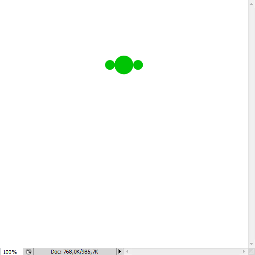
先看看最終效果圖:

第1步
我們將創建鉛筆首先是因為它是我們最棘手的項目圖標。 該中心繪製一個小的綠色循環的使用橢圓選框工具(米)的帆布頂。 然後兩個較小的副本,每邊1。
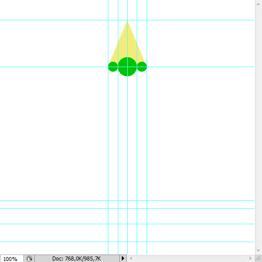
第2步
激活單元從視圖菜單(Shift + Command鍵+;),創造鉛筆指南。扣三個各界紀念鉛筆地方的垂直邊緣會。繪製低於要麼使用鋼筆工具性(P界分層淺黃色三角形)或多邊形套索工具(長),搶購的指導,以確保對稱性。命名此三角“的一角。”
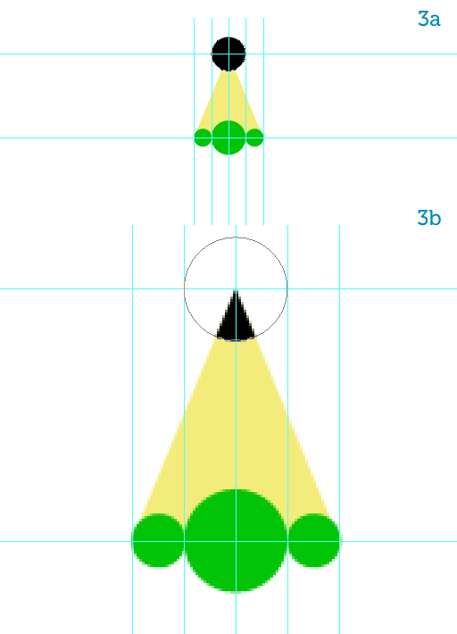
第3步
繪製一份有關“蒂普托普黑色圓圈”,在一個單獨的圖層,命名為“領導”(3)。命令,單擊“提示”層,使用此選項來掩蓋“領導”。右鍵單擊圖層調板中的面具,選擇圖層蒙版應用到農作物的“領導”的“小費”(3B)條。
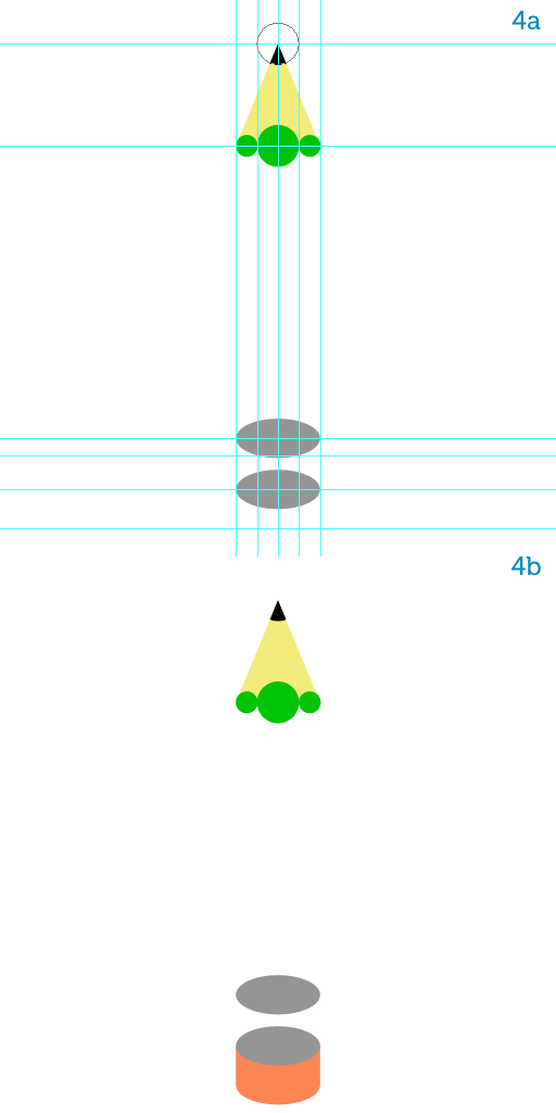
第4步
Add two gray ellipses at the bottom guides, right where the metal clasp will be, using the Ellipse Tool (U) (4a).在底部添加導遊兩個灰色橢圓,右手邊的金屬扣將,使用橢圓工具(ü)(4A)條。
Copy the bottom ellipse, name it "eraser" and move it down.複製底部橢圓,將其命名為“擦”,並下移。
Change its color to a pinkish orange then rasterize all three shapes.改變它的顏色粉紅橙色然後柵格三種形狀。
With a simple rectangular selection fill in the gap between the bottom gray ellipse and the "eraser" (4b).用一個簡單的矩形選擇填寫底部之間的灰色橢圓和“擦差距”(4b)的。
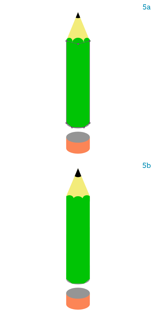
Step 5第5步
Move the bigger green circle down a bit, then using the Pen Tool (P) draw the shape for the pencil’s body, snapping to the guides (5a).移動了一點更大的綠色圓圈,然後使用鋼筆工具(規劃)繪製的鉛筆的身體形態,捕捉到導遊(5A)條。
Adjust the position of the three circles so they look like a crown on top of the main shape then merge all green shapes together (5b).調整三環地位,它們看起來像一個主要形狀的頂部皇冠然後合併在一起的綠色形狀(5B)條。
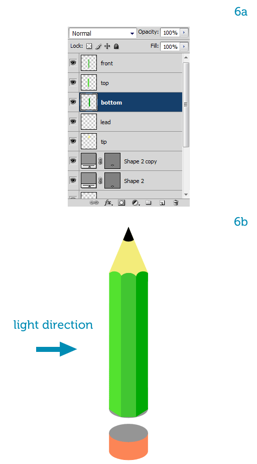
Step 6第6步
Using the Rectangular Marquee Tool (M) and snapping to the edges of the circles at the top, select each vertical side of the pencil’s body then hit Shift + Command + J to create a new layer from the selection, or go to Layer > New > Layer via Cut.使用矩形選框工具(M)和捕捉到頂部的圓圈的邊緣,選擇每一個鉛筆的身體垂直一邊,然後按下Shift + Command鍵+ J,為創建一個選擇,新的層或去層>“新建“通過剪切層。
You will thus obtain three layers.你將因此獲得三個層次。
From left to right name them as follows: "top", "front" and "bottom."從左至右依次為它們命名如下:“頂”,“前線”和“底部。”
When we rotate the pencil so it points to the sketchbook, the left side will be on top, the middle side will be at the front, and the right side will be at the bottom (6a).當我們旋轉鉛筆,以便它指向寫生,左邊將頂部,中間方將在前面,右側將在底部(6A)款。
Let’s imagine that the light comes from the left so when we rotate the pencil to make it write on the sketchbook it will appear to be coming from the top.讓我們想象,光從左側所以當我們旋轉鉛筆,使寫在寫生,將顯示為來自上層來。
To comply with the light’s direction we have to make the "top" layer lighter and the "bottom" layer darker.為了遵守光的方向,我們必須使“頂部”層打火機和“底”層暗。
You can use the Brightness/Contrast, the Hue/Saturation (Command + U) or the Levels window to accomplish that.您可以使用亮度/對比度,色相/飽和度(命令+ U)或該級別的窗口實現這一目標。
It’s your choice (6b).這是您的選擇(型)。
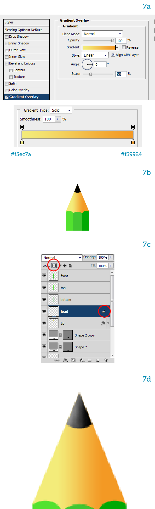
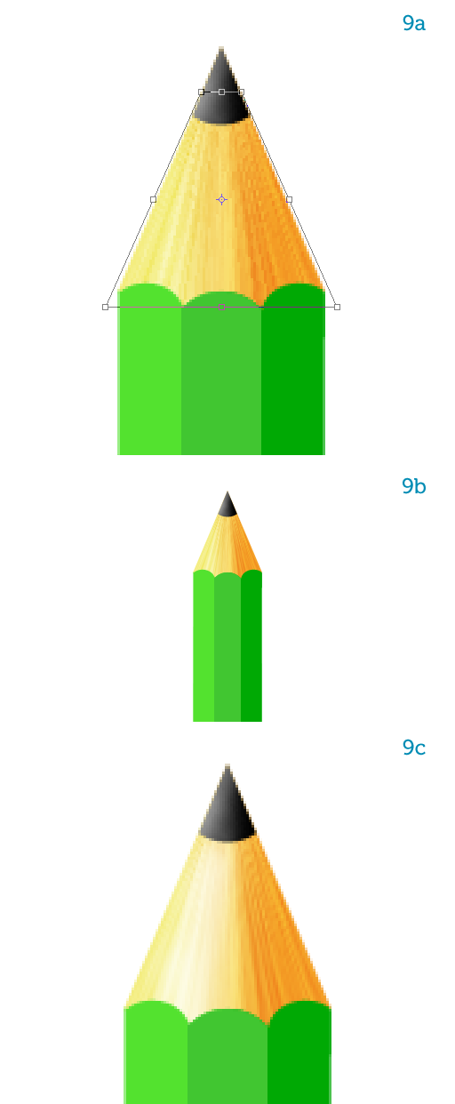
Step 7第7步
Let’s shade the tip now.讓我們現在陰影的技巧。
Add a pale yellow-to-orange horizontal Gradient Overlay style to the "tip" layer (7a) so the right part, which will be the bottom once the pencil is rotated, is darker (7b).添加淡黃色到橙色水平漸變疊加樣式的“小費”層(7A)條,以便正確的一部分,這將是底部一旦鉛筆旋轉,是深色(7B)條。
To enforce the lighting we must also brighten the left side of the "lead."執行燈光照亮,我們還必須對“牽頭的左邊。”
Lock its transparency so you won’t be able to paint inside the existing pixels (7c).鎖其透明度,使你無法描繪內(7C條)現有的像素。
Hit B to select the Brush Tool and make sure the color is pure white.點擊乙選擇畫筆工具,並確保顏色是純白色。
Then paint a single stroke along the left side with a big, soft, white brush, while keeping the opacity to a low number (7d).然後畫左側的一桿的大,柔軟,白刷,同時保持透明度,以一個較低的數字(7D條)。
This adds a nice, subtle highlight.這增加了一個不錯的,微妙的亮點。
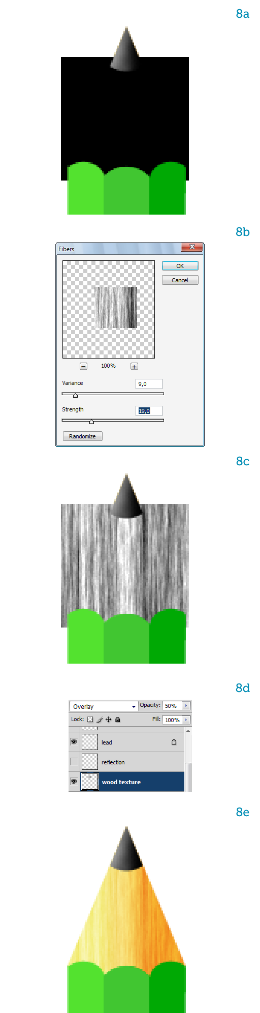
Step 8第8步
Type D to activate the default colors (black and white).D型激活默認的顏色(黑色和白色)。
Create a black square on a new layer between the "tip" and the "lead" and name it "wood texture" (8a).創建之間的“小費新層一個黑色正方形”和“領導”,並命名為“木材紋理”(8A)條。
Go to Filter > Render > Fibers and choose the same values as in image 8b.轉到濾鏡“>渲染”纖維,並選擇在圖像8B條相同的值。
The resulting texture (8c) hides the "tip" so we reduce the Opacity to 50% and choose the Overlay blending mode (8d).由此產生的紋理(第八期丙)隱藏的“小費”,所以我們不透明度降低到50%,並選擇覆蓋混合模式(8d)。
The wooden tip now has a nice color and a realistic grain (8e).木一角現在有一個很好的顏色和現實糧食(腋)。
Step 9第9步
All we have to do now is deform the "wood texture" so it follows the contour of the "tip."所有我們現在要做的是變形的“木紋”,因此它遵循了“小費輪廓。
”
To do that type Command + T to activate Free Transform, then right-click the texture on the canvas and choose Perspective.為此,鍵入Command + T將啟動自由變換,然後右鍵單擊畫布上的紋理和選擇視角。
Drag the top anchor points inward to fit the texture to the "tip" (9a).拖動錨點頂部向內以適應紋理的“小費”,(90)。
Take a look at what we have so far (9b).看一看我們迄今(9B條)看看。
We want to add a bit of shininess to the pencil so let’s paint the main highlight on the "tip" on a new layer, using a soft, white brush.我們想補充一點的光亮的鉛筆,以便讓我們畫上的“小費一個新的層”的主要亮點,用軟,白刷。
Reduce the highlight’s opacity to let the texture shine through (9c).減少突出的透明度,讓通過(9C條)紋理光澤。
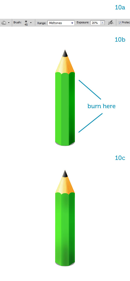
Step 10第10步
Let’s introduce some color variation on the pencil’s body, it looks flat right now.讓我們介紹一些對鉛筆的體色變化,但現在看起來平坦。
Select the Burn Tool (O) from the toolbar and set it up as in image 10a.選擇刻錄工具的工具欄(O)和設置它在圖像10A條。
It’s important to use a large, soft brush and very low opacity.重要的是要使用大,軟刷和非常低的透明度。
Use several brush strokes to darken the top and the bottom of all three sides, making the bottom darker (more brush strokes).使用幾種筆畫變暗的頂部和底部的所有三個方面,使底部暗(更多筆畫)。
Try it on the "bottom" layer first to get a feel for the Burn Tool.嘗試在“底部”層中第一個獲得的燒傷工具感覺到。
Once you’re satisfied with the shading (10b), repeat this for the remaining two layers.一旦你滿意陰影(10B條),重複其餘兩層這一點。
Make sure the pencil becomes progressively darker as you go to the right and to the bottom (10c).請確保鉛筆逐漸變得黑暗,當您去的權利和底部(-10℃)。
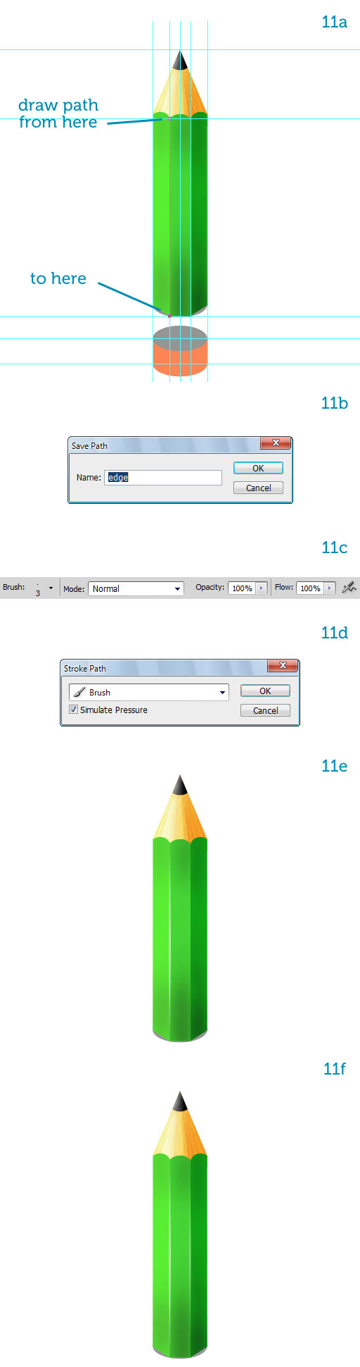
Step 11第11步
Let’s make the edges pop out.讓我們的邊緣彈出。
With the guides showing and Snap active, draw a path along the left vertical side (11a).隨着導遊的積極表現和管理單元,繪製沿左側垂直側(11A)條路徑。
In the Paths palette double-click it to name it "edge" (11b).在路徑調色板雙擊它命名為“邊緣”(B款)。
Now set up a 3px, hard-edged, white brush (11c).現在成立了一個3px,硬邊,白刷(11C條)。
Create a new layer on top of the three sides and select it.
創建一個對三方新的層,頂部選擇它。
In the Paths palette right-click on the "edge" and choose Stroke Path.在路徑調色板的權利的“邊點擊”,然後選擇描邊路徑。
From the pop-up window select the Brush and toggle on the "Simulate Pressure" option (11d).
從彈出式窗口中選擇在“模擬壓力”選項(11d的)刷和切換。
This is what it looks like: a nice, tapered highlight (11e).這是它看起來像:一個不錯的錐形突出(11E條)。
Name the layer "edge."名稱層“的邊緣。
”
Create a second edge by copying the first one.通過複製創建第一個第二個優勢。
Make the copy a bit transparent since it’s closer to the bottom where less light arrives (11f).副本有點透明的,因為它比較接近底部到達那裡少輕(11層)。
Step 12第12步
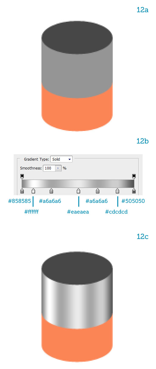
On to the metal clasp now.到現在的金屬扣。
Hide the "body" and "tip" layers.隱藏的“身體”和“提示”層。
Darken the top ellipse.變暗頂端橢圓。
It will be the hole where the wooden pencil inserts.這將是洞,插入的木製鉛筆。
Fill in the lighter ellipse to close the gap (12a).填寫打火機橢圓縮小差距(第12A)。
Apply a Gradient Overlay style with many highlights to get a nice metal surface (12b).適用於許多突出了漸變疊加樣式,得到了一個很好的金屬表面(12B)款。
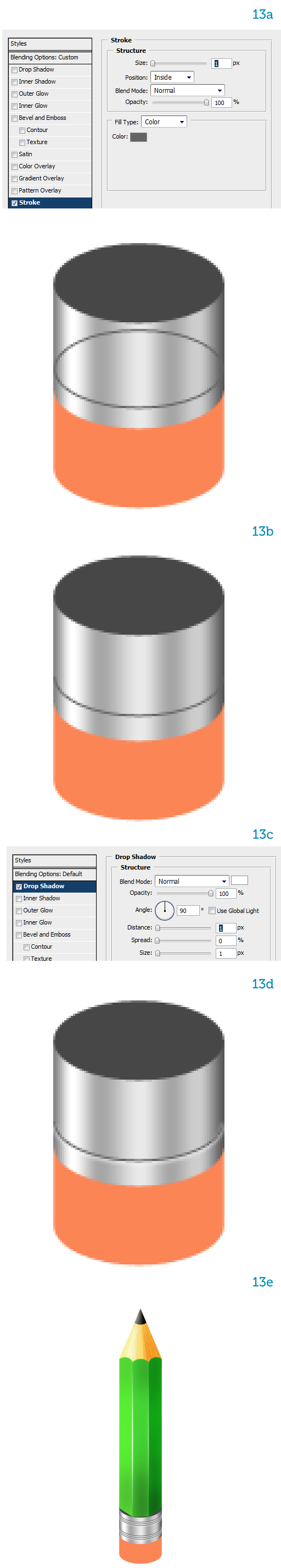
Step 13步驟13
Duplicate the "hole" ellipse.重複的“洞”橢圓。
Name the copy "ring," reduce its Fill to 0% then add a dark Stroke (13a).複製名稱“環”,減少其填充為0%,然後添加一個黑暗的中風(第13A)。
Erase the top half (13b).擦除的上半部分(第13B)。
Now add a white Drop Shadow (13c) to simulate a highlight (13d).現在添加白色陰影(碳)來模擬一個亮點(第13)。
Make a bunch of copies of the "ring" and arrange them over the metal clasp (13e).記下的“環副本的一群”,並安排了金屬扣(13E條)他們。
Group all similar layers together.集團一起類似的層。
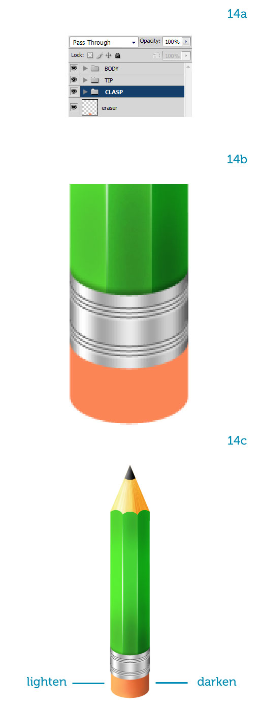
Step 14步驟14
Before we move on let’s take a look at the layer structure we have.在我們繼續之前,讓我們看一看在層結構,我們看看。
It’s important to keep files tidy.重要的是要保持檔案整潔。
We can easily toggle layers on and off, which speeds up productivity.我們可以很容易地切換和關閉層,其中達生產力的速度。
It also makes complex layer structures less scary to look at (14a).這也使得複合層結構不可怕,研究(第14A)。
Move the "CLASP" group above the "BODY."移動高於“機構的”標識和器具“組。
”
Add an internal shadow by painting with a soft, black brush on a separate layer (14b).添加繪畫軟,一個單獨的層(第14B)黑色畫筆內部陰影。
To complete the pencil we have to shade the eraser.為了完成鉛筆,我們必須遮蓋橡皮擦。
First let’s scale it down a bit so it’s smaller than the metal clasp.首先,讓我們的規模下來了一點,所以比金屬扣小。
Then lighten the left part and darken the right part.然後,減輕左側的一部分,變暗的權利的一部分。
How do you do that?你怎麼做呢?
Just like we did for the "lead," lock the eraser’s transparency then paint with low opacity brushes along the edges, white to lighten and black to darken (14c).就像我們的“領導做了,”鎖定橡皮擦的透明度,然後畫刷透明度低沿邊緣,白色和黑色,以減輕變暗(14C條)。
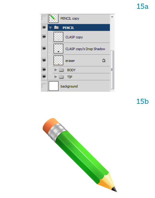
Step 15第15步
The pencil is complete.鉛筆完成。
Select all layers and group them as "PENCIL."選擇所有圖層和群組中的“鉛筆。
”
Duplicate the group and hit Command + E to merge all layers into one.重複組和打擊司令部+ E至合併為一個所有層。
Keep the original group for later adjustments, just in case, but work on the single layer from now on (15a).隨後進行調整,保持原有的組,以防萬一,但是從現在開始的工作(第15a)在單層。
Rotate the pencil 135 degrees clockwise so it points down diagonally (15b).旋轉135度順時針鉛筆使其指向下斜(15B條)。
Lock this layer to avoid messing it up.鎖定該層,以避免它搞亂。
You can see now that the shading suggests light coming from the top.現在您可以看到顯示的陰影光線來自上層。
Let’s keep that in mind.讓我們記住這一點。
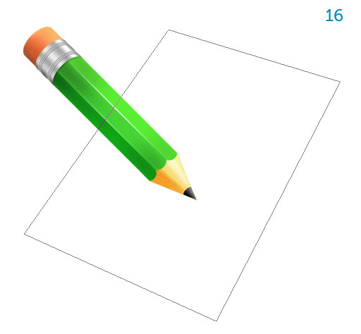
Step 16步驟16
Using the Pen Tool (P) draw the top page of the sketchbook (16a).使用鋼筆工具(規劃)提請寫生(16A條)首頁。
The sketchbook’s orientation nicely contrasts that of the pencil for a balanced composition.在作畫的方向很好的對比,對鉛筆的組成平衡。
Step 17步驟17
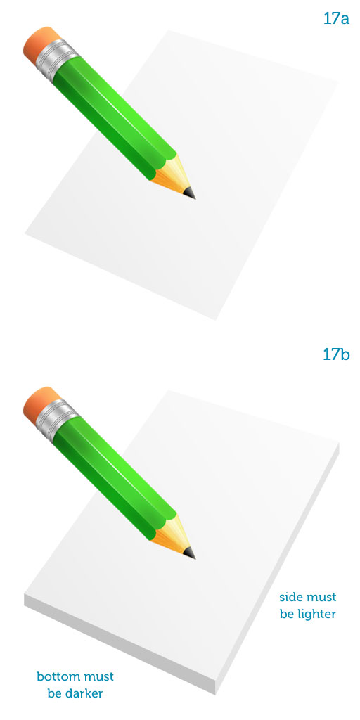
Shade the page with a soft gradient, from almost white (top) to a light gray (bottom) (17a).色光的頁面軟梯度,幾乎白(頂端),淺灰色(下)(17A條)。
Using the Pen Tool again add thickness to the sketchbook.使用鋼筆工具又增加厚度的人物。
Use two shades of gray, making the bottom darker (17b).利用灰色兩種顏色,使底部暗(17頁)。
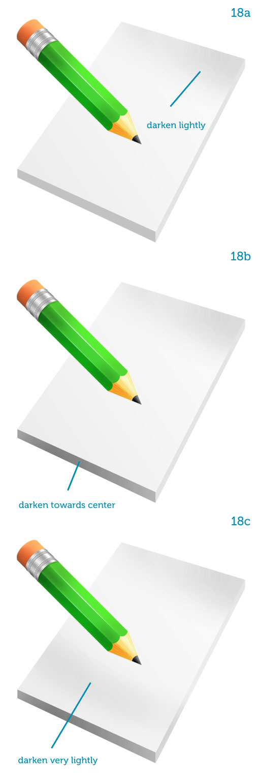
Step 18第18步
Lock the transparency of all three layers (page, side and bottom).鎖的透明度所有三個層次(頁,側面和底部)。
Using soft, black brushes with low opacity darken the page at the top and bottom.使用變暗在頂部和底部的頁面透明度低軟,黑色刷子。
Also darken the bottom thickness near its center.同時變暗其中心附近的底部的厚度。
These color variations suggest a slight unevenness that makes the objects look a bit more natural (18a, 18b, 18c).這些顏色的變化,提出一個輕微的不平衡,使得對象看上去有點更自然(18A條,第18B,18C型)。
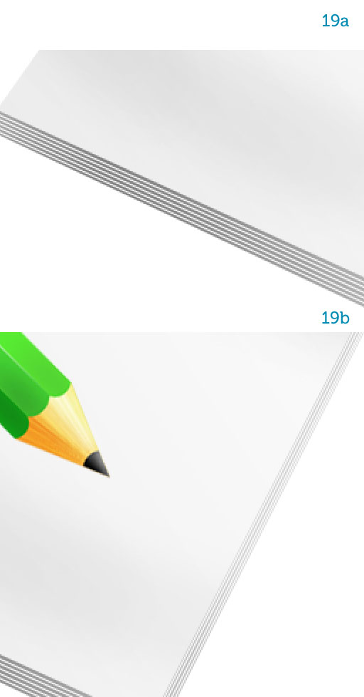
Step 19步驟19
Using the Line Tool (U) set to white, draw parallel lines over the bottom and side (19a and 19b).使用直線工具(ü)設置為白色,得出的底部和側面平行線(19A及19B)。
They represent the stack of pages, of course, so adjust their opacity to your liking.他們代表頁的堆棧當然,所以調整其透明度根據自己的喜好。
Group them together once you’re done.集團在一起一旦你完成。
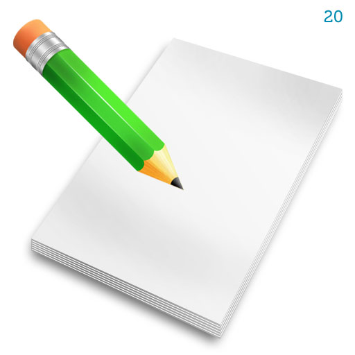
Step 20步驟20
You can now duplicate all the sketchbook layers and merge them together.現在,您可以複製所有的寫生層和合併在一起。
Again, keep the original layer structure for any changes you require down the line.再次,保留您需要的任何更改了東線的層結構。
When creating icons you optimize the smaller sizes (48px, 32px, 16px) by eliminating those elements that won’t be readable anymore, for example the page lines.當創建圖標您優化,消除這些因素,不會再是可讀的小尺寸(48px,32px,16px),例如網頁線。
Add a Drop Shadow to the sketchbook using a simple layer style.添加陰影的寫生使用簡單的圖層樣式。
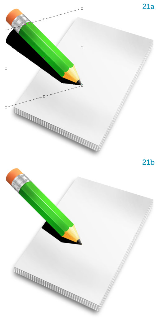
Step 2121步
The light comes from the top so the pencil projects a shadow onto the sketchbook.光線來自上方,因此項目的鉛筆寫生上陰影。
Duplicate the pencil layer and turn it black.重複鉛筆層,把它黑色。
I usually hit Command+ U to bring up Hue/saturation and move the Lightness slider all the way to the left.我通常打命令+ U鍵彈出色相/飽和度和亮度滑塊移動一直向左側。
But everyone develops a unique workflow.但大家都開發了獨特的工作流程。
Skew the shadow (Command + T, right-click and choose Skew) so it lies parallel to the sketchbook’s top and bottom sides (21a).歪斜的影子(Command + T鍵,用鼠標右鍵單擊並選擇偏移),因此它是平行於寫生的頂部和底部(第21A)。
Alt-click the line between the "sketchbook" and the "shadow" layers to mask the shadow with the sketchbook’s contour (21b).按住Alt鍵之間的“寫生路線”和“陰影”層,以掩蓋與寫生的輪廓(乙)的影子。
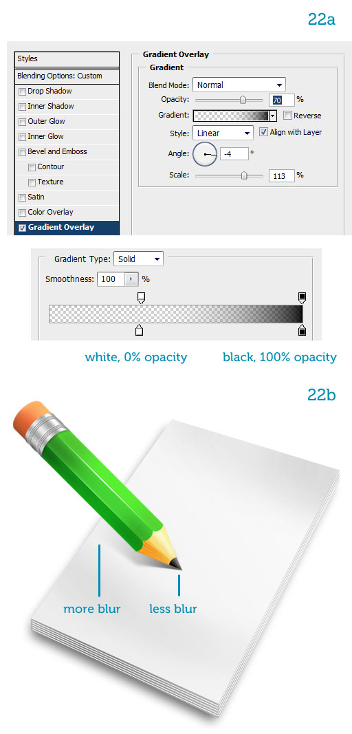
Step 22步驟22
Reduce the shadow’s fill to 0%.減少陰影的填充為0%。
Add a Gradient Overlay, making the left color stop transparent and the right color stop black (22a).添加一個漸變疊加,使得左邊的顏色停止透明和正確的顏色停止黑色(22A條)。
The shadow now fades away from the tip of the pencil to the border of the page.現在的影子沒有不散的筵席從鉛筆頂端的頁面邊框。
Blur the shadow using the Blur Tool.模糊的影子使用模糊工具。
The farther from the tip, the blurrier (22b).越遠,從冰山的模糊(22頁)。
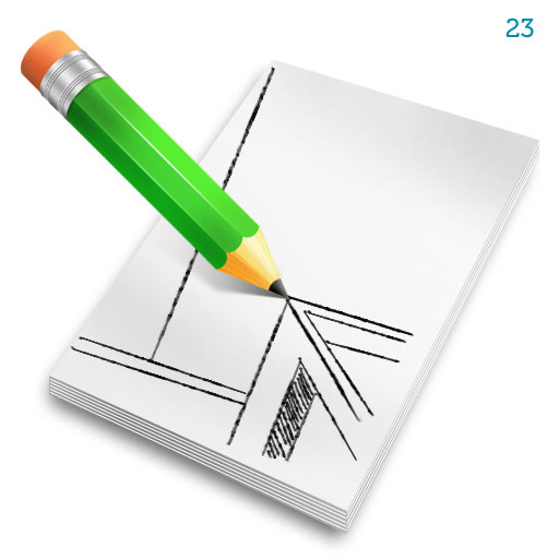
Step 23步驟23
The icon is now complete.該圖標現已完成。
All we have to do now is draw a little sketch on the page.所有我們現在要做的就是在頁面上繪製一些素描。
I’ll leave you free to draw whatever you want.我將離開你自由地繪製任何你想要的。
Just pick a brush with a little texture from the Brush Presets (hit F5) and you’re good to go.您只需選擇了以小刷預置紋理畫筆(按F5鍵),你可以安心上路。
— —
文章永久連結為: Photoshop繪製超真實的鉛筆教程